Application analysis
Click the application name in the application list to enter the application analysis page. On this page, you can view the statistical data of each indicator of the application in the form of net chart, column chart, indicator card, trend chart, map, list and horizontal bar chart.
User experience score
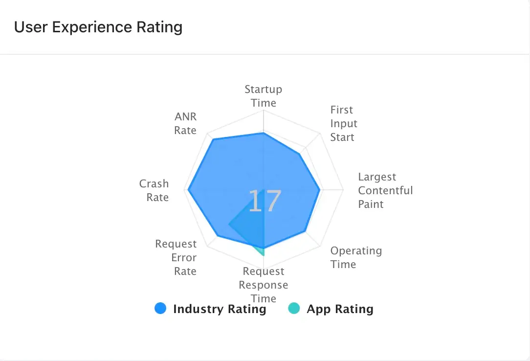
User Experience Rating Mesh Chart Display the total score of the current application and the score of each indicator, as well as the industry score of each indicator. The score displayed in the middle is the total score of the current application. Hover the mouse over the blue area to show the industry scores of various indicators. Hover the mouse over the green area to show the scores of the indicators currently applied.
The scoring rule can be modified. For details Global Settings, see Scoring settings.

Histogram analysis
Bar Chart Show the specific values of the two indicators of the number of starts and the number of active devices in the statistical period. Hover the mouse over a point or bar on the curve to view the statistics in granular time.

Metric insight
Metric insight Display indicator cards and analysis charts of corresponding indicators. Indicators include startup time, interactive time, first screen time, operation time, request response time, request error time, crash rate and stutter rate. Chart types include trend chart, list and map. The data for each type of chart can be exported to CSV format by clicking the download icon in the upper right corner of the chart.

Trend chart analysis
Indicator trend chart Display the change trend chart of 8 indicators including startup time, interactive time, first screen time, operation time, request response time, request error rate, crash rate and stutter rate in the statistical period. You can click the indicator card in the lower left corner to switch to the display indicator on the right. Hover the mouse over a point or bar on the curve to display the statistics in granular time.

List analysis
Click the icon in the upper right corner of the indicator trend chart to view the Top 5 list. The user can click the indicator card on the left to switch indicators, in which the interaction time, first screen time, operation time, request response time, request error time, crash rate and stutter rate can be viewed in the Top 5 list.
- When the and First screen time indicator cards are clicked Interactable time, the Top 5 list displays the indicators of the top 5 pages in terms of open times, including page name, open times, slow interactive ratio, slow first screen ratio, interactive time and first screen time. Click the page name to enter the Page interaction page and view more statistical charts and data about the page.
- When the indicator card is clicked Operating time, the Top 5 list displays the indicators of the top 5 operations. The list displays the operation name, number of operations, availability, proportion of smooth operations, proportion of slow operations and proportion of stuck operations. Click the operation name to enter the Operation details page to view more statistical charts and data about the operation.
- When the indicator card is clicked Request response time, the Top 5 list displays the indicators of the top 5 domain names in terms of response time. The list displays the requested domain name, request response time, throughput rate, number of requests, number of slow requests, proportion of slow requests and transmission rate.
- When the indicator card is clicked Request error rate, the Top 5 list displays the indicators of the top 5 error types in terms of error times. The list displays the error type, error times, and error rate.
- When you click Collapse rate the indicator card, the Top 5 list displays the indicators of the top 5 exceptions in terms of crash rate. The list displays the exception, latest version, latest report time, number of occurrences and percentage, and number and percentage of affected devices.
- When clicking Stuck rate the indicator card, the Top 5 list displays the indicators of the top 5 abnormal problems in the stutter rate. The list displays the abnormal problems, the latest reporting time, the number and proportion of occurrences, and the number and proportion of affected devices.

Map analysis
Click the icon in the upper right corner of the indicator trend chart to view the map. Shows the distribution of performance data by country Map in the form of a map and horizontal bar chart. Different time intervals in the map will show different colors. The horizontal bar chart on the right shows the top 15 regions with the highest throughput by default. The user can click the indicator card on the left to switch indicators, in which the start time, interactive time, first screen time, operation time, request response time and request error time can be viewed.
The world map is displayed by default. Click a specific country to enter the map of that country. Similarly, it can be positioned at the provincial level (including municipalities directly under the Central Government), prefecture-level cities and district and county levels. Mouse over an area to display detailed statistics. The bar chart on the right will also be displayed accordingly with the change of the map.
Country

Provinces:

Prefecture-level cities:

Districts and counties: