Public Operation
Filter settings
On the page Filter conditions with filtering settings, the user can click Add a filter, and the system will automatically pop up a drop-down menu of conditions for you to select. After hovering the mouse or clicking the condition, the lower level condition will continue to be displayed, and so on, until the last level condition is displayed. The second and third level conditions support keyword search.

The selected filter condition will be displayed in the filter condition column, and then click the Inquire button to see the filtered statistical data.
Click the icon next to the Query button to add a label to the current filter condition as a common condition. After entering the label name, click Confirm to display it in the common condition column. When you want to query the statistics of the same condition again, just click the common condition. The system can save multiple query conditions to cope with different query scenarios.
Statistical Period and Granular Time
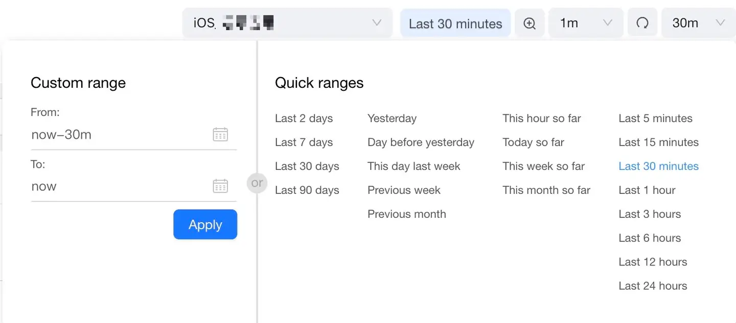
App products can store the performance monitoring data of the last 90 days. Within this interval, you can specify any statistical period to query the monitored data. App product provides two statistical period selection methods: custom time range and quick query time range.

-
Custom Time Range: After clicking
the icon, select the month, year, and day in the calendar. After completion, 00:00:00 of the selected date will be displayed in the date input box by default, and the part can be modified Hours, minutes, seconds manually. You need to set the start date and end date separately.
-
Quick Query Time Range: Some common query ranges are preset in the system. You can click them to set the time range quickly.
-
Select time granularity: The system can select the time granularity displayed in the chart according to different time ranges. The fixed time granularity is: 1 minute, 5 minutes, 1 hour, 1 day, 1 week and 1 month. For example, if you select the last 30 minutes, you can view the chart data at the granularity of 1 minute and 5 minutes; if you select the last 30 days, you can view the chart data of 1 day, 1 week and 1 month. Granular time refers to the time statistical interval of the data of each point in each chart, which will change with the length of the statistical interval by default.
-
Click the time range zoom-in icon
to dynamically expand the statistical range according to the time range you selected before.
-
Click the drop-down menu on the far right of the time control to turn on or off the automatic refresh of chart data. The default is closed. To turn it on, simply select the refresh interval.
-
Click the Reset Refresh Timing icon
to refresh the data in each chart. If the automatic refresh function is turned on at the same time, the data refresh will start to be re-timed.
Explain: The statistical period is a global control. When it is set anywhere, the data in the page involved in the selection of the statistical period will be refreshed.
Select the time granularity
All "Timeline " charts of the App product support the function of selecting the specified time. Use the [|] vertical bar in the chart to set the "Global Time Control" as the selected time period. Click the button on the right side of the chart to return to the selected time granularity.

Add a chart
Hover the mouse over the chart to do the following:
- Click the
icon in the lower right corner of the chart to add the current chart to the component list of the Tingyun screen.
- Click the
icon in the lower right corner of the chart to add the current chart to the Chart Library of the Cloud Intelligence Report.
Different charts support different situations, please add according to the specific situation.
My message
Hover the mouse over the account name in the lower left corner and select My message from the pop-up menu to enter the My Messages page. Prompt messages pushed by the system are centrally displayed here.