Version distribution
Version distribution The module can help customers with version management, and the version performance is clear at a glance. Version comparison data can be obtained intuitively without complicated version filtering and data query, so as to meet the needs of customers for in-depth analysis, so that the product can evolve continuously and quickly fix problems.
Click Version distribution in the left navigation bar to enter the Version overview page.
Version trend chart Show changes in the number of new users, active devices, or launches for the top 5 app versions. The ranking is based on the total number of new users, active devices or startup times in the statistical period from high to low.
List of versions Display the version number, throughput rate, number of active devices, comprehensive score, startup time, available time, first screen time, operation time, request response time, crash rate, request error rate, stutter rate, first receiving time and other index data of each application version, which can comprehensively evaluate the performance of each version.

Version comparison
Check the version you want to compare in the list (you can add up to three versions), and then click the button in the upper right corner Contrast of the list to view the version performance comparison. Contrast The column shows the difference of version performance. The red is the increase, and the green is the decrease. The formula is: difference percentage = (comparison version – base version)/comparison version.
You can select the data comparison time through the Time drop-down menu above.
Version details
Click the blue font link of the application version number in the list to view the statistical details of the version.
Version statistics Show performance metrics for the current version of the application.
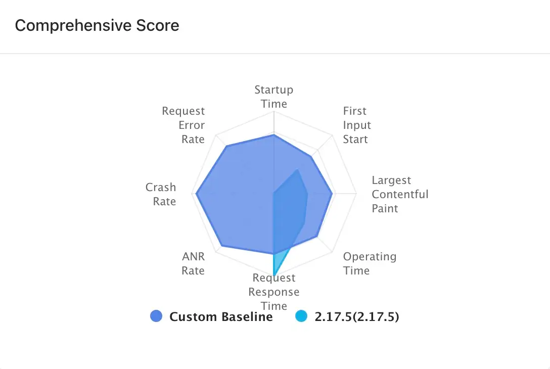
Overall score The radar chart calculates the performance score of the publication according to the eight dimensions of request response time, crash rate, stutter rate, request error rate, operation time, first screen time, startup time and interactive time. For the settings of each threshold, baseline and weight, please go to Global settings the Scoring Settings tab in to configure.

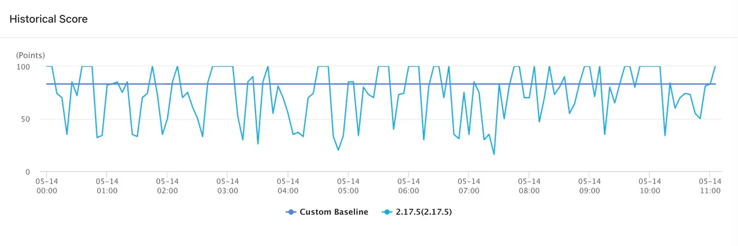
The right side shows the score change over the statistical period, and also shows the baseline score curve, so that you can compare with the standard. Hover over a point on the curve to view detailed data.

The comparison between the startup time, interactive time, first screen time, operation time, request response time and the user-defined baseline User experience trend chart can be displayed respectively.
Anomaly trend chart You can show how the request error rate, crash rate, and stutter rate compare to a custom baseline.
Changes in the number of active devices and throughput User trend chart can be shown separately. The unit of throughput is RPM (Request per minute).
On the version details page, you can still compare versions by clicking the button at the top Add a comparison version of the page to select the version.