Public Operation
Switch access mode
The performance analysis data can be viewed by switching the access mode. Tingyun Web supports mobile browser, WeChat, PC and all four types of analysis modes. You can view them by switching the icon in the upper right corner of the page. From left to right, they are all, PC, mobile browser and WeChat.
Select the statistical period
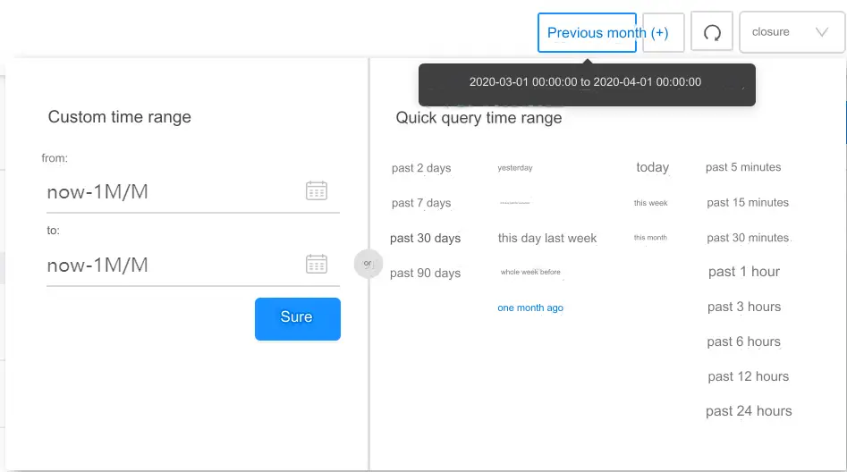
The performance monitoring data of the last 90 days can be stored in the Tingyun Web. Within this interval, you can specify any statistical period to query the monitored data. Keynote Listening Cloud Web provides two statistical period selection methods: custom time range and quick query time range.

Custom Time Range: After clicking the icon, select the month, year, and day in the calendar. After completion, 00:00:00 of the selected date will be displayed in the date input box by default, and the part can be modified Hours, minutes, seconds manually. You need to set the start date and end date separately.
Quick Query Time Range: Some common query ranges are preset in the system. You can click them to set the time range quickly.
Click the time range zoom-in icon to dynamically expand the statistical range according to the time range you selected before.
Click the drop-down menu on the far right of the time control to turn on or off the automatic refresh of chart data. The default is closed. To turn it on, simply select the refresh interval.
Click the Reset Refresh Timing icon to refresh the data in each chart. If the automatic refresh function is turned on at the same time, the data refresh will start to be re-timed.
Granular time refers to the time statistical interval of the data at each point in each chart, which varies with the length of the statistical interval.
Explain: The statistical period is a global control. When it is set anywhere, the data in the page involved in the selection of the statistical period will be refreshed.
Add a chart
Hover the mouse over the chart to do the following:
- Click the
icon in the lower right corner of the chart to add the current chart to the component list of the listening cloud screen.
- Click the
icon in the lower right corner of the chart to add the current chart to the Chart Library of the Cloud Intelligence Report.
- Click the icon in the lower right corner
of the chart to add the current chart to the Dashboard for listening to cloud data insights.
Different charts support different situations, please add according to the specific situation.